The next point in our CRO for Shopify series is all about product pages. Product page CRO is exciting because it’s where you get to be the most creative. Whilst a lot of your website will be dictated by function, your product pages are an opportunity for you to show off your passion.
What you say about your products and the media you use (which is discussed below) is largely up to you. Although there are qualities to persuasive copy and engaging media that you will want to adhere to, you can really push your brand’s personal touch on these pages.
In fact, creating unique, considered content for these pages is going to be much more persuasive than something which sounds off the shelf! Google also prefers original content, so copying a manufacturer’s product description is not advised.
But I am going to assume that you already knew all that and have awesome copy already. Below are a few things you can do to improve your Shopify product pages that go beyond the words on the page.
Layout your Shopify product pages so there isn’t wasted white space.
Typically, Shopify product pages are laid out in a way which wastes a lot of white space on the page. The product photos are placed on the left, with additional photos below. The CTA, product description and additional information then goes on the right.
Because the copy takes up more space than the product photos, there is a big white space left underneath the product photos. This can make the page look amateur and cluttered.
A great way to get rid of this issue is to bring the product description (and additional information) below the product photographs and the CTA. To make the page even more visually appealing, make use of expandable drop-down boxes which reduce visual information overload.
Information should be structured for scan readers.
Imagine you are looking for some dishwasher safe mugs and you find some mugs you like the look of. But the product description is long, and when you scan read it you can’t see “dishwasher” mentioned. What would you do?
Chances are you will leave that product page, possibly even the whole website. This is because when we are doing anything online, we are impatient and expect to be able to complete our task quickly and easily. When the product description and additional information about a product is not made easy to absorb, people are likely to miss vital information, become frustrated or bored.
To help users get to information which is important to them on product pages quickly you can do some or all of the following:
- Use headers to separate information into sections,
- Utilise bullet points to get your features and benefits across concisely,
- Use different colour backgrounds to indicate different text topics,
- Use white space every 4-5 lines to keep paragraphs short,
- Utilise drop down boxes to keep information in distinct expandable sections.
Just like with improving general navigation of your Shopify site, ensuring you have a clear information structure will improve your Shopify Conversion Rate as it helps users achieve their task. By having a clear information structure, you are making it as easy as possible for users to complete the product selection process.
Because users can complete their task quickly, they are less likely to get bored and remain engaged with your website. You can read more tips on improving your website’s engagement rates here.
Product photos, 360-degree views and videos should be used to convey reasons to buy.
Your product pages should aim to replicate the experience of seeing your product in real life and having a salesperson talk it up to the customer.
That’s a tall order from a page on a website. But luckily you can get very close to reaching that goal with high quality media.
360-degree views help users replicate holding the product in their hands or moving around it in a store. They are particularly useful for products where users are likely going to want to see all the product details, like a laptop or a piece of furniture.
High quality zoomable product photos are also great when users are likely to be detail orientated. When actually touching a product isn’t possible, being able to zoom in close can give the user an idea of how it may feel to touch or wear the product. This is useful for clothing items in particular as the texture and quality of material can be grasped from an up-close image.
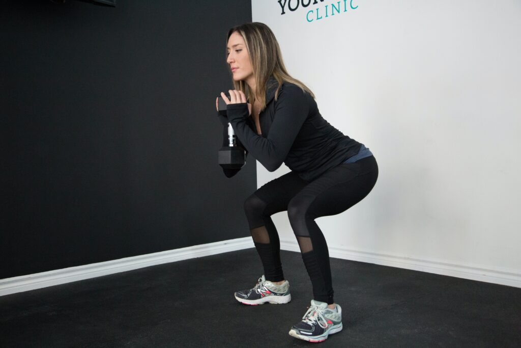
Videos fall into two camps. Video can be used to show the product in use (such as showing someone doing squats whilst wearing leggings or showing someone selecting settings on a washing machine). This kind of videos give the user an indication of what it would be like to own and use the product.
This kind of video should be aspirational, it should create desire for the product by suggesting other appealing factors. Examples include; you will become strong and fit if you buy the leggings, or you will have a beautiful home if you buy the washing machine.
High quality lifestyle photography (photographs which show the product in use in an aspirational setting) also help to create desire for the product by suggesting the implied emotional benefits of ownership. For the biggest impact, video should be used in addition to these kinds of photographs, not in place of them.
The other kind of video is video which provides more in-depth information about the product to create a sense of exclusivity, quality and desire. Video can be used effectively to tell the story of how a product was made or to highlight its key features. Potentially, this kind of information will be more effective when presented as a video than in text format as people are often reluctant to read online.
That being said, even if you have the best quality product media, you should still be writing some kind of product description as not everyone will want to spend time interacting with media. By providing all options, users can select the right format of information for them. The moral of the story is: give people the information they want, in the way they want to consume it.
Join me next week for the last in the CRO for Shopify article series.
So far in the CRO for Shopify series we have covered:
- Winning back lost customers with a basket abandonment plugin.
- De-Americanising your Shopify site to increase trust.
- Getting users to where they want to be by making your navigation more intuitive.
(And now) improving your product pages.
Well done if you have read each instalment!
We just have one more article to come, which will complete the series.
In the last article I will be discussing how to collect email addresses and nurture the customer relationship.
I hope you will join me next week for our concluding chapter.